VIEW OUR SERVICES
For those looking to build a cohesive and consistent brand presence & grow their business.
type below and hit enter
Search the blog
BUSINESS
MARKETING
BRANDING
Browse by topic
I'm Ali Rae and I love building brands.
So let's build that business one blog post at a time.
Read more about me
FANCY SEEIN' YOU HERE!
PERSONAL
Let's whip that brand into shape!
BRAND AUDIT
CHECKLIST
FREEBIE ALERT
Branding 5 at 5 | Chobani
October 19, 2023

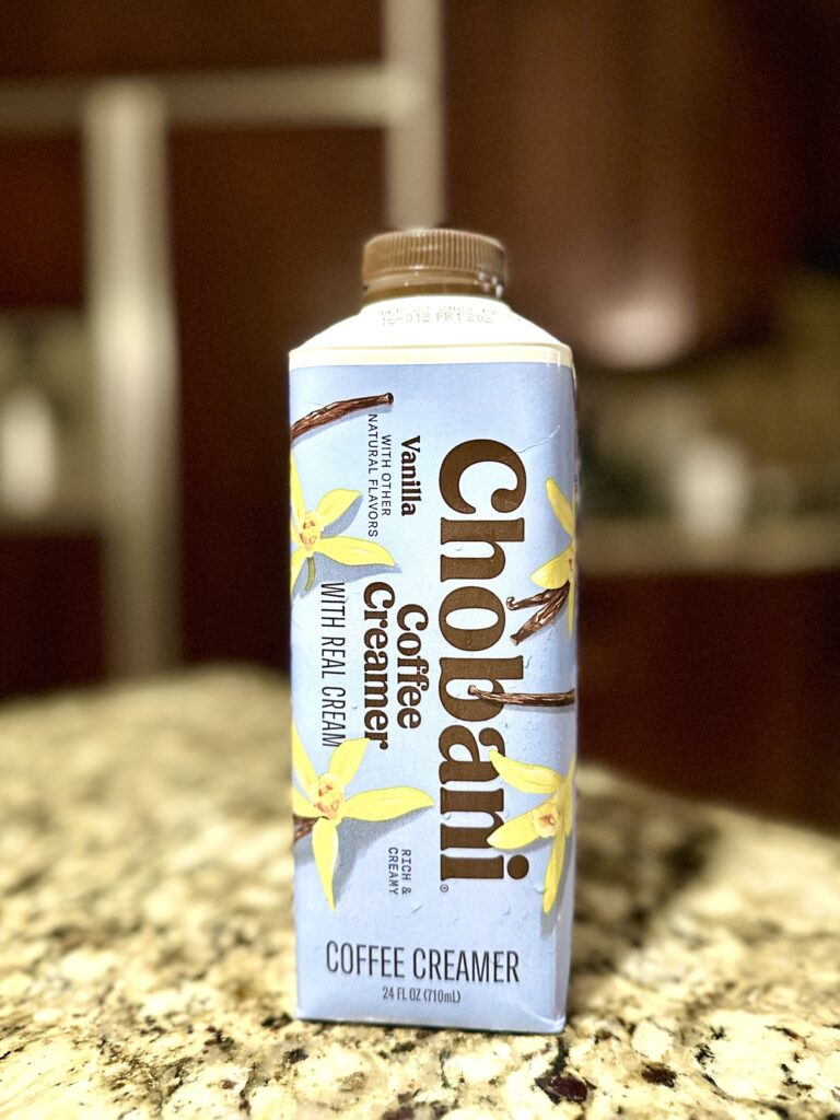
Welcome to the Branding 5 at 5 where I take 5 minutes (at 5am when this segment was recorded live on Instagram–yes, I like to torture myself by waking up at the crack of dawn) to dissect a big brand into digestible pieces to apply to your small business. Today’s unsuspecting brand is CHOBANI.
First, let’s learn a little background on Chobani:
- It was originally a yogurt company (but has since expanded its product line) founded by Hamdi Ulukaya, a Turkish immigrant.
- Chobani is closely related to the word “chopani,” which means “shepherd” in his native language. This is an homage to his childhood in Turkey growing up on a dairy farm! He has a really cool founder story (seriously–he bought an abandoned Kraft yogurt factory in the middle of nowhere New York when he started the business!!), but that is a story for another time.
Big Brand Ideas
Let’s dive into a few things that are different about Chobani.
Target Market
Ulukaya saw an untapped market within the American yogurt space. He targeted men and woman because the current yogurt players targeted mainly women, opening up another 50% of the population he could sell to! In a world that constantly tells us to niche down, maybe let’s just approach the existing market in a new way.
Product Design & Placement
In the beginning he invested over $250k in packaging design. That is HUGE for a start up! But he knew the packaging had to be visually different. Typical yogurt packaging in American is tall and thin with a narrow opening on top. So Ulukaya distinctly designed Chobani’s packaging to be short and stout with a wide opening.
Next, he insisted Chobani yogurt MUST be stocked in yogurt/dairy section of grocery, not in the speciality/gourmet area. Where the consumer encounters the product has an impact on how they feel about the product. Chobani, although a new brand, felt more accessible in the general yogurt section.
Mission & Values
Making high quality and nutritious food accessible to more people, while elevating our communities and make the world a healthier place
Chobani’s Mission
A couple things I want to point out:
The word “accessible” kept popping up throughout my research: from the “impact batches,” which are specific batches of yogurt whose proceeds go to a specific cause, like ending childhood hunger; to the design of their 2018 rebrand, incorporating hand drawn fruit in the packaging and visual messaging; to the accessibility of jobs to refugees. Chobani is all about being an accessible brand!
Second, I want to emphasize the part of their mission that is “elevating their communities.” The impact batches I mentioned earlier are SUCH a cool initiative. Also, they have the “Tent Partnership for Refugees” that trains other corporations how to have an impactful refugee hiring practices. And they practice what they preach because 30% of their manufacturing staff are all refugees! They also, literally just yesterday, packed lunches and donated yogurt to a food bank. Oh, and they pay off children’s school lunch balances…I mean, c’mon. How could ya not love Chobani?
Tangible Takeaways
So now to take all these big brand ideas and apply them to your own small business…let’s see how that’s possible!
- Approach the existing market in a new way–just like Ulukaya targeted men initially, which was untapped within current yogurt marketing campaigns. It is really easy to look to the next provider/business owner, see what they’re doing, and emulate it. I encourage you to take a step back and see if there is a way you can differentiate yourself and your business. That could be the service/product itself or where you encounter the consumer.
- To the product-based businesses, invest in product packaging! The visual difference of packaging shape, paired with an eye-catching label design + placement allowed Chobani to essentially create its own sub-category within the yogurt space.
- Pick two to five values and/or words you want to guide your brand. The words “accessible” and “humanitarian” consistently came up throughout my research. “Accessible” guided their 2018 rebrand down to the font and hand-painted elements and “humanitarian” guides all of their well…humanitarian efforts. And that mission statement (as far as I know) was created when the company was created in 2002, over two decades ago, and they’re still following the principles behind those words to guide any new products or initiatives they bring to market.
Let Chobani be your inspiration!
Now I’m not sure what you’re waiting on, but you should get there and grow!
Let's talk business.
@brandandmarket.co
find me on
LET'S WORK TOGETHER
brand & market newsletter
Let's make you the best in your brand and your market.
We turn listings into legacies.
BRANding & COHOSTING
View website terms
View privacy policy
© 2025 ali rae haney productions, llc. all rights reserved. privacy policy. site by Ali Rae Haney + Showit
schedule discovery call
Ready to make your listing into a legacy?